

Web · 9 min read
My Blog Has a Site Map Again
 Stefan Christoph
On this page
Lots of websites used to have a page called “Site map”. You probably remember it: a long list of links in the footer, every section of the site on one page. I hadn’t thought about it in years, until this month.
The site got a redesign in October. New editorial theme, a page for the series, a talks page, a theme toggle. With a bit over 400 posts, seven series and a weekly review, it was getting hard to see what lives where, even for me. So I asked my agent for a map. A real one, with islands.
The treasure map
There’s a new button in the header now, between “Stay in touch” and the theme toggle. It opens /map/: a treasure chart of the site.
Every island is a section. The Isle of Writing holds the posts, with a red X on the latest one. Each islet in the Series Archipelago is one series, numbered to match the list below the chart. The Weekly Atoll is a ring, because the weekly review comes round every Sunday. Podium Peak has the talks, the Microblog Shoals are the short notes going back to 2010, and Lighthouse Point is the About page. The restricted area is marked “Here be dragons”, which felt right.
Switch the site to dark mode and the parchment turns into a night chart. Speaking of dark mode, the toggle got a third state on the way. It used to flip between light and dark, and once you clicked it there was no way back to “do what my computer does”. Now it cycles through auto, light and dark. Auto follows your operating system’s appearance setting through the prefers-color-scheme media query [8], so if your Mac switches appearance automatically, the site switches at sunset too.
And because I couldn’t help it, there’s a pirate version of my avatar at the top of the page, with a tricorn hat, a parrot and a rolled-up map. An image model drew it from my usual comic-style avatar.

A short history of site maps
The site map page was common on the web of the late 1990s and early 2000s. Navigation was weak and site search often missing, so a page that linked every section was the safety net for lost visitors. It helped a second kind of visitor too: the crawlers of early search engines found pages by following links, so a page linking everything got the whole site found.
People didn’t use them much, though. Nielsen Norman Group tested site maps in two studies, seven years apart [5], [6]. In the first, when test users were asked to learn how a site was organised, 27% of them turned to the site map [5]. In the second it was 7%, while the share of surveyed sites that had a site map rose from 48% to 71% [6]. Their advice barely changed between the two: call it “Site Map”, keep it static and compact, and “a map should be a map, not a navigational challenge of its own” [5].
Search engines got their own map. In June 2005 Google introduced Sitemaps 0.84, an XML file in which site owners list the URLs they want crawled [1], [10]. In November 2006 Google, Yahoo and Microsoft agreed to support one shared protocol, Sitemaps 0.90, documented at sitemaps.org [2]. In April 2007 the engines, now joined by Ask.com, added autodiscovery: a single Sitemap: line in robots.txt tells supporting crawlers where the file is [3], [4]. My robots.txt still has exactly that line.
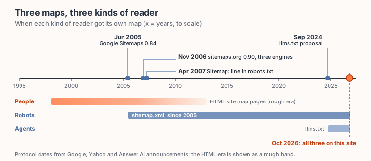
Each kind of reader got its map at a different time. The HTML era is drawn as a rough band; the protocol dates are from the announcements.
So did site maps disappear? The machine version never did. Most CMSs and static site generators can write a sitemap.xml, usually without being asked, and nobody looks at it. The human version is what faded. I didn’t find a study on why, so this is my reading:
- Search became the front door. People arrive on a single page from a search result and rarely start at the homepage.
- Sites got too big for one page. A shop with 100,000 products or a blog with 400 posts doesn’t fit on a list you can take in at a glance.
- Navigation got better: mega menus, breadcrumbs, tags, related posts.
- Phones. A dense page of links is miserable on a small screen.
- The search-engine reason faded. Once crawlers had sitemap.xml, they no longer depended on an HTML page to find everything.
Then, in September 2024, Answer.AI proposed llms.txt: a Markdown file at the root of a site with a short summary and curated links, ideally to Markdown versions of the pages, written for language models [7]. It’s a community convention, and no standards body stands behind it. I added one to this site back in March, when I made it easier for agents to read [9]. That makes three: first people got a map, then search engines, now language models.
How the treasure map works
The map is one inline SVG inside a Hugo template. No JavaScript, no image file. I wrote the islands, the dashed route, the compass rose and the waves as SVG paths at fixed positions on a 1000 × 580 canvas.
Everything that changes comes from Hugo at build time: the post counts, the links, the X on the latest post and the islets. Here’s the islet part. One islet per entry in the series data file, in file order, and the number on it is the same number the index below uses:
{{- range $i, $s := first (len $isle) $series }}{{ with index $isle $i }}
<a href="/series/{{ $s.slug }}/" aria-label="Series {{ add $i 1 }}: {{ $s.title }}">
  <title>{{ $s.title }}</title>
  <path class="tm-land" transform="translate({{ index . 0 }} {{ index . 1 }})" d="M-28 2C-30-14-12-22 4-20C22-20 32-8 27 6C21 20-14 22-28 2Z"/>
  <text x="{{ index . 0 }}" y="{{ add (index . 1) 6 }}" class="tm-num">{{ add $i 1 }}</text>
</a>
{{- end }}{{ end }}
$isle is a fixed list of nine positions in the archipelago, and first (len $isle) stops the loop there. With seven series, there’s room for two more. A tenth would still show up in the index, just without an island, until I draw one. (The first version had no first, and an independent review caught that a tenth series would have stopped the build.)
The colours are CSS variables: parchment and sepia by default, dark blue and pale ink when the site is in dark mode. The same toggle that switches the rest of the site switches the chart.
So a new post raises the count and moves the X, and a new series in the data file gets an islet the next time the site builds, which happens every night.
Keeping the list short
The first version of the index listed every post under the chart. All 400 of them, grouped by year. It worked, and it was far too long, and it would only get longer.
Now the index shows the six latest posts, then one collapsed row per year with its post count. That grows by one row a year instead of one row per post. Each series is one collapsed row with how many parts are out (5/8 for Lunch Break Physics right now), and the weekly review shows the latest four issues.
Nielsen Norman Group would frown at the collapsed rows, since they advise against site maps that make you work to reveal parts of them [6]. I think it’s a fair trade here. The chart above gives the one-glance overview. The rows below are for when you already know which island you want.
People, robots and agents
So this blog now has three maps.
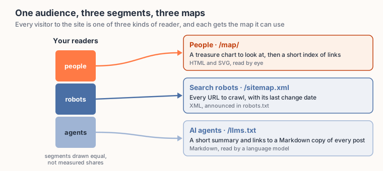
One audience, three segments, and each segment gets the map it can read.
The treasure map is for people. sitemap.xml is for search engine crawlers, and robots.txt points them to it. llms.txt is for language models and the agents that use them.
sitemap.xml and llms.txt are still plain lists, and I’m thinking about what an agent would actually want. Probably the same data the treasure map is built from, as JSON it can filter without reading every post. That’s for another Saturday.
What maps does your site give its readers? And which of the three would you miss first?
Go find the X: schristoph.online/map/
Sources
- [1] Sitemaps (Wikipedia) · Sitemaps 0.84 introduced by Google in June 2005; joint support November 2006; autodiscovery April 2007.
- [2] Joint support for the Sitemap Protocol (Google Search Central Blog, November 2006) · Google, Yahoo and Microsoft support one protocol.
- [3] What’s new with Sitemaps.org? (Google Search Central Blog, April 2007) · Sitemap discovery through robots.txt; Ask.com joins.
- [4] Webmasters Can Now Auto-Discover With Sitemaps (Yahoo Search Blog, April 2007, archived) · the
Sitemap:line in robots.txt. - [5] Site Map Usability, 1st study (Nielsen Norman Group) · 27% of users turned to the site map; “a map should be a map”.
- [6] Site Map Usability (Nielsen Norman Group) · second study seven years later: 7% of users; site maps on 71% of surveyed sites, up from 48%; static designs recommended.
- [7] /llms.txt, a proposal to provide information to help LLMs use websites (Answer.AI, September 2024) · the original llms.txt proposal; the current version lives at llmstxt.org.
- [8] prefers-color-scheme (MDN Web Docs) · the media query that reports the user’s light or dark preference.
- [9] Making My Website AI-Agent Friendly · my earlier post on llms.txt and Markdown versions of every post.
- [10] Our Valentine’s day gift: out of beta and adding comments (Google Search Central Blog, February 2007) · Google on its initial launch of the Sitemaps protocol in June 2005.
❤️ Created with the support of AI (Kiro)